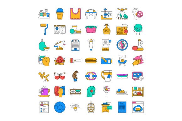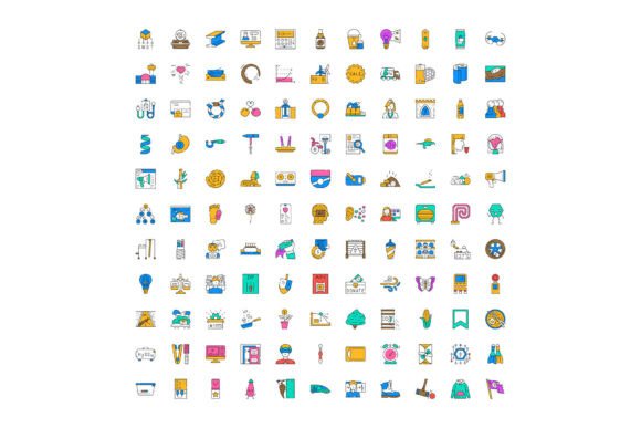
Why Linear Outline Icons and Colorful Thin Line Icons Are Essential for Modern Digital Design
Icons are the silent language of digital interfaces—small, intuitive visuals that guide users, clarify actions, and reinforce brand identity. Among the most versatile and widely adopted icon styles today are linear outline icons and colorful thin line icons. Whether you're designing a mobile app, building a responsive website, crafting an educational infographic, or developing internal dashboards, these lightweight, scalable, and expressive icons play a foundational role in effective visual communication.
What Exactly Are Linear Outline Icons?
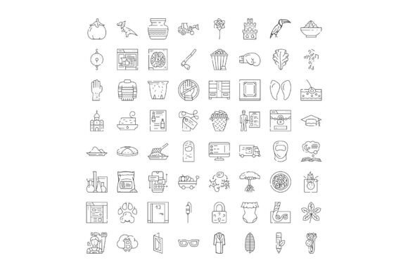
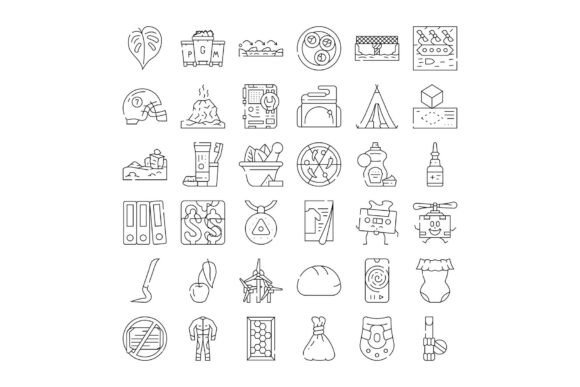
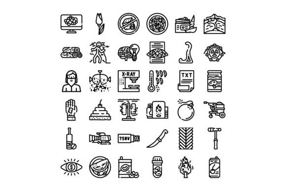
Linear outline icons are minimalist, monochromatic symbols drawn with consistent stroke widths—typically using a single path or connected strokes without fills. Think of them as elegant line drawings: clean, uncluttered, and highly legible at small sizes. They follow strict visual rhythm—uniform line weight (often 1.5px to 2px), balanced negative space, and geometric precision—to ensure clarity across devices and resolutions.
Unlike filled or solid icons, linear outlines rely on contour and shape recognition rather than color or texture. This makes them exceptionally adaptable: they scale seamlessly from 16×16 pixels in a toolbar to 96×96 pixels in a presentation slide—without pixelation or visual distortion.
How Do Colorful Thin Line Icons Differ—and Why Does It Matter?
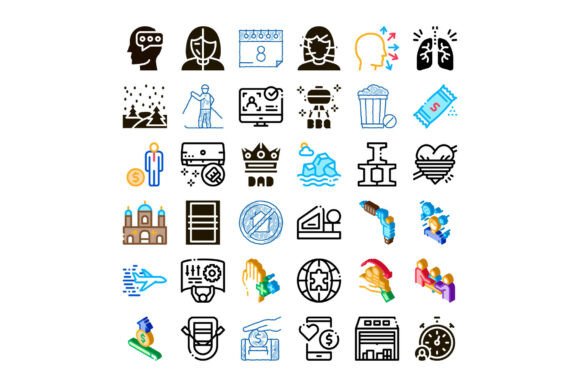
While traditional linear icons are often grayscale or monochrome, colorful thin line icons expand expressive potential by introducing subtle, purposeful color accents. These aren’t bold, saturated illustrations—they’re refined, low-saturation hues applied thoughtfully to key elements: a blue checkmark in a success state, a soft coral heart in a wellness dashboard, or mint-green leaves in an eco-friendly UI.
This approach merges the structural integrity of thin-line design with emotional resonance and contextual signaling. Research in human-computer interaction shows that strategic color use in icons improves recognition speed by up to 27% and supports accessibility when paired with sufficient contrast and clear outlines.
Real-World Use Cases Across Industries
- Web Design: Navigation menus, feature cards, and call-to-action buttons benefit from linear icons’ clarity and fast load times—especially on performance-sensitive sites.
- Mobile Applications: Thin line icons reduce visual noise in compact interfaces while maintaining tap-target visibility—a critical factor for iOS and Android compliance.
- Educational Infographics: A diverse collection of colorful thin line icons helps learners associate abstract concepts (e.g., “data analysis,” “collaboration,” “sustainability”) with instantly recognizable visuals—boosting retention and engagement.
- Enterprise Dashboards: Consistent iconography streamlines data interpretation. For example, a thin-line upward arrow in teal signals growth, while a gray downward arrow in the same style indicates decline—enabling rapid pattern recognition.
- Startup Landing Pages: Startups use these icons to communicate complex offerings simply: a thin-line cloud + gradient accent conveys “secure cloud storage”; a stylized gear + orange stroke implies “customizable automation.”
Why “Diverse Collection” Isn’t Just Marketing—It’s Functional Necessity
A truly diverse collection of linear outline icons goes beyond quantity—it reflects real-world inclusivity, conceptual breadth, and practical utility. It includes:
- Cultural and gender-neutral representations—for example, inclusive people icons showing varied abilities, attire, and interactions—not just default silhouettes.
- Conceptual variety—from technical terms (“API integration,” “zero-trust security”) to soft skills (“active listening,” “design thinking”).
- Activity-based verbs—like “schedule,” “verify,” “export,” “annotate”—not just nouns. This supports action-oriented UI patterns.
- Contextual variants—a “document” icon might appear in editing mode (with pencil), sharing mode (with arrow), or locked state (with shield)—all sharing the same line weight and proportions.
Without diversity in coverage, designers waste time layering custom illustrations—or worse, default to ambiguous, generic glyphs that confuse users. A robust library eliminates guesswork and accelerates iteration.
Dispelling Common Misconceptions
Despite their widespread adoption, several myths persist about linear and thin-line icons:
- “Thin lines don’t work for accessibility.” — False. When designed with WCAG-compliant stroke contrast (minimum 4.5:1 against background) and paired with descriptive alt text or ARIA labels, thin-line icons meet accessibility standards—even better than overly detailed pictograms that blur at small sizes.
- “Colorful icons sacrifice scalability.” — Not if built using vector formats (SVG). Each color is a defined stroke or path—not raster pixels—so resizing preserves crispness and color fidelity.
- “Any line icon will do—consistency doesn’t matter.” — Inconsistent line weights, spacing, or corner radii create visual friction. Users subconsciously detect mismatched styling, reducing trust and perceived professionalism.
How These Icons Fit Into Broader Design Systems
Modern design isn’t about isolated assets—it’s about systems. Linear outline and colorful thin line icons integrate naturally into scalable design systems because they:
- Align with typographic hierarchy—line weight often matches font stroke metrics (e.g., matching icon strokes to the weight of a medium sans-serif)
- Support theming—swap a single CSS variable to shift all icon colors globally (e.g., dark mode toggle)
- Enable token-based development—icons become reusable tokens in Figma, Storybook, or React component libraries
- Accelerate internationalization—since they rely on universal visual metaphors, not text, they translate effortlessly across languages
In fact, leading platforms like Google’s Material Design and Apple’s SF Symbols emphasize outline-first approaches—not as a stylistic preference, but as a functional standard rooted in performance, clarity, and cross-platform reliability.
Choosing the Right Collection: What to Look For
When evaluating a large collection of colorful thin line icons, prioritize these practical qualities:
- Consistent grid alignment—icons should sit cleanly on a 24×24 or 32×32 baseline grid, ensuring uniform spacing in layouts
- Multiple export formats—SVG (for web), PDF (for print), and multi-size PNGs (for legacy support)
- Licensed for commercial use—including redistribution in SaaS products or white-labeled applications
- Well-documented naming conventions—e.g.,
icon-user-profile-filledvs.icon-user-profile-outline—to prevent team confusion - Regular updates—new icons added quarterly for emerging domains like AI ethics, remote collaboration, or climate tech
Final Thought: Icons as Silent Collaborators
At their best, linear outline and colorful thin line icons don’t draw attention to themselves—they quietly enable understanding. They help a teacher explain carbon cycles to middle-schoolers. They let a non-technical founder navigate analytics without jargon. They give developers a shared visual vocabulary across frontend, backend, and product teams.
That’s why investing time in selecting or building a thoughtful, diverse, and technically sound icon collection isn’t a “nice-to-have.” It’s foundational infrastructure—like typography, color systems, or responsive grids. In a world where attention is scarce and clarity is currency, these small, precise lines carry remarkable weight.
Whether you're sketching wireframes, refining a brand system, or teaching digital literacy, remember: every icon tells a story. Make sure yours speaks clearly, inclusively, and with intention.